Getting Started
To import Icon Map Pro into your Power BI report, you can follow the instructions from Microsoft Learn: Import a Power BI visual from AppSource into your workspace.
Once you've imported Icon Map Pro, and added it to your report canvas, the next thing to do is assign your data fields. Every row of data assigned to the visual, will result Icon Map Pro evaluating that row, to understand what type of map object should be rendered. Each row must have a unique ID - this enables functionality such as cross-highlighting from other visuals.
To add circles onto the map, you would drag in your unique ID field into ID and your fields containing your coordinates into the Longitude and Latitude field wells. These should be set to aggregation type "Average" by clicking the down arrow on the field. Then finally drag in a numeric field into the Circle Size field well.
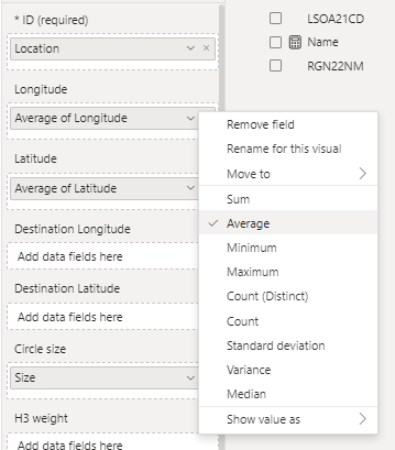
Flip to the formatting tab to check that under "Data Layers" the "Circles" toggle is enabled.
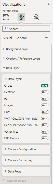
You should now have circles rendering on your map. Check out the rest of the documentation to discover the full formatting options.